Spring 2024
Classes Taken
- Typography 1
- Graphic Design 1
- Intro to Woodworking
January 2024 - May 2024
Spring 2024 is when I officially started working on the machine after my preparatory art courses. I expanded my knowledge beyond illustrator and started using photoshop and Indesign during studio time. My priority during these projects was studying the fundamentals of color, layout, typography, and overall a consistent aesthetic/identity of the design. Woodworking was a way to show my design in a three dimensional space, staying true to what inspires me most: my culture.
Centre - Brand Logo
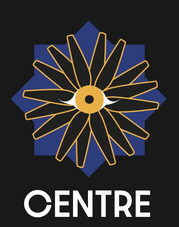
Drone photography is airial and a unique viewing for photos and videos. Centre is a brand identity made for a drone photographer interested in making his side hustle into a more professional business. I used colors that represented the sky and sun. The logo is made up of drone blades spinning around the point of the eye.
Mariposa - Layout Exploration
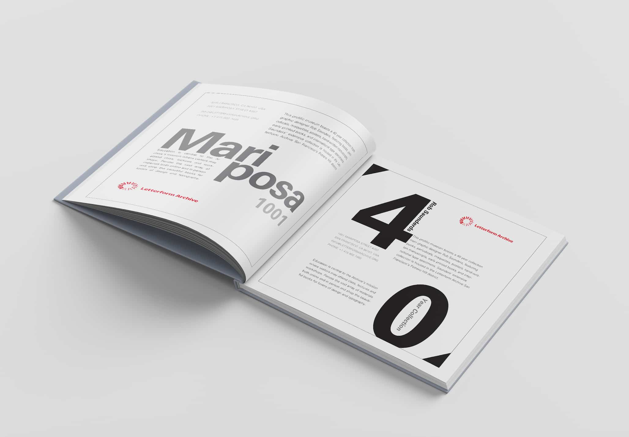
This project was a layout exercise used from Letterform Archive copy. I was tasked with creating unique layout in two color while still managing to make them unique and readability, specifically heigharchy.
Wood Working
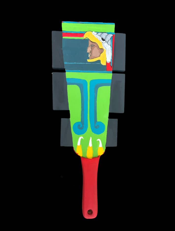
I sketched the design based off the macuahuitl, atraditional aztec weapon. I sawed the top of the swoard as a whole piece and carved the handle as the second piece. I connected them tother to make the paddle and hand painted the design that is modern and commemorates the aztec artistic design. This was then used as a ping pong competition, a respectable weapon for battle.
Fall 2024
Classes Taken
- Art of China
- Typography 2
- Graphic Design 2
August 2024 - December 2024
Fall 2024 I began more advanced courses and developing more original idea projects with guidance from professors but mostly navigating my own ideas. I was also introduced to asian art but specifically from China, this sparked my interest in Asian art and culture.
Carnivorous Plants Guide
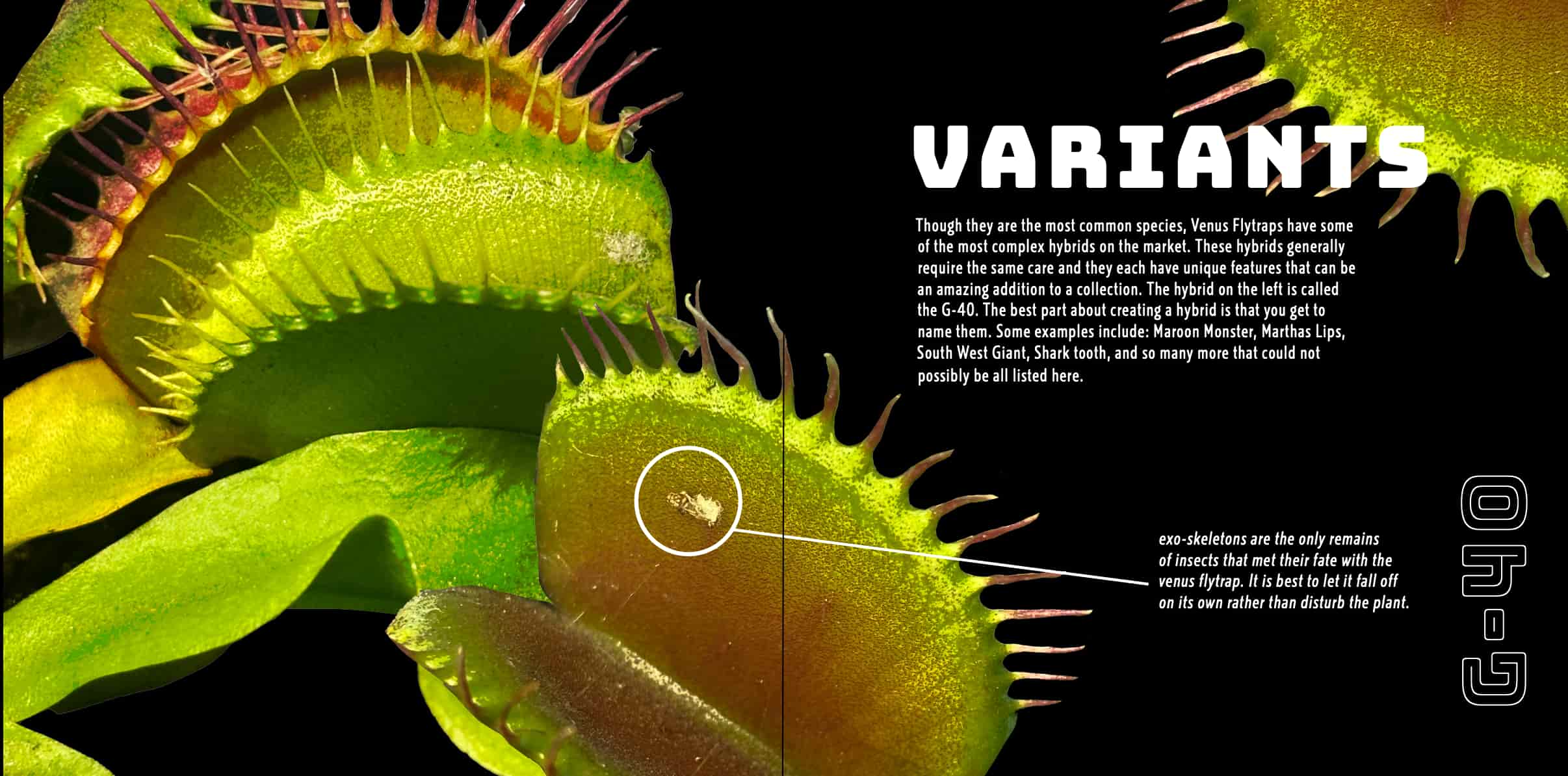
This piece is based off scientific plant care books. I wanted to create a carnivorous plant guide book that captivated audiences with its imagery and encouraged learning. I used grids similar to the science plant books and did all of my own photography and editing. This project was prepared for print, specifically to be made into a book.
Book Design Cover
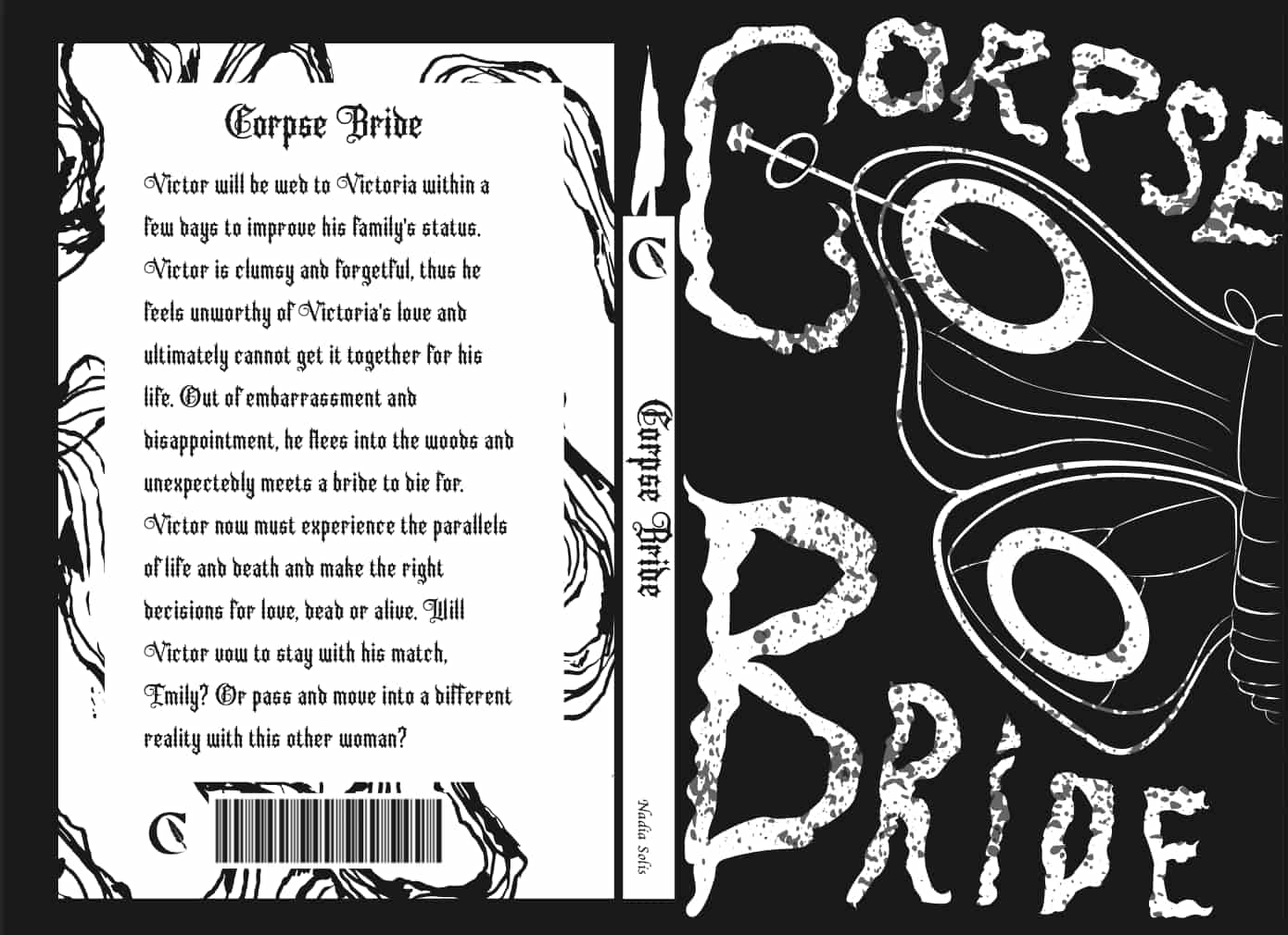
This project is a book cover design based off the famous couple Emily and Victor from Tim Burton's, "Corpse Bride". The goal for this project was to create a cover design without using drawings or photos of the actual characters. I used the symbolism of the butterfly and the wedding ring in the movie. The ring rests on the pin that is stabbing the butterfly. This represents Emily's views of marriage and how the betrayal kept her pinned down to the mortal plane, the shame not allowing her to come to peace with her death. The "C" that surrounds the pin represents her fingers and how it desperately held onto the wedding ring throughout the movie.
Awareness Poster
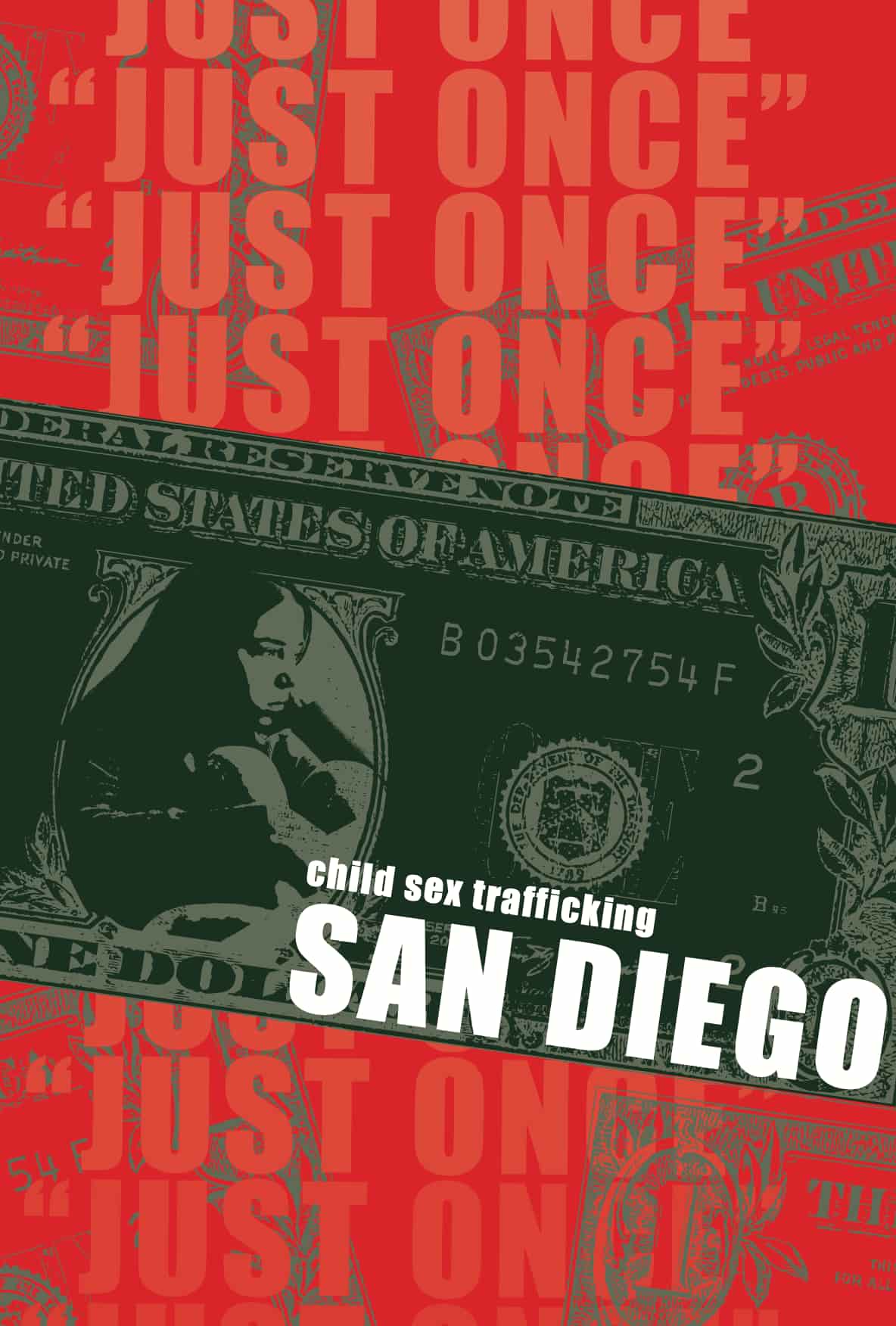
This was an awareness campaign poster for San Diego residents. San Diego is a hotspot for human/child trafficking. The poster contains red and green, it captures audiences attention to talk about an uncomfortable topic. It primarily focuses on children being seen as monetary value. Not all trafficking is a mysterious figure stealing you away from your family to sell you. Sometimes, it is your family members or relationship partners that ask you for “favors” to turn you into profit. They may ask you to do it “just once” but people who love you would not want to exploit you in that way.
Spring 2025
Classes Taken
- Digital Media
- Art Since 1945
- Digital Photography
- History of Graphic Design
January 2025 - May 2025
In Spring 2025, I began a freelance project and purchased my first professional camera to start taking a more serious approach to photography. I was also participating in art history classes that went over the history of art around the world since 1945 as well as graphic design. I remember being particularly interested in Andy Warhol and how he viewed commercialism and artwork being coexistent.
Dipped by Joc - Logo
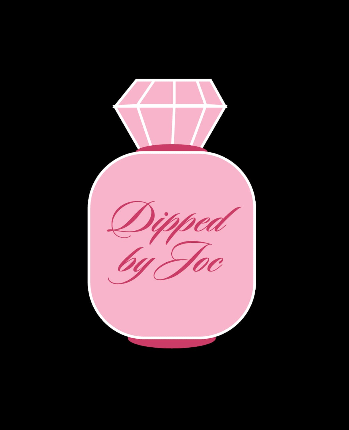
This branding and logo design was a freelance project for a local nail tech in San Diego, “Dipped by Joc”. This logo depicts a nail polish bottle with a diamond cap. She wanted her brand to promote femininity and luxury. Her goal for her clients was to leave her shop feeling renewed and beautiful. Artistic expression was a pillar for her business so we went the bold and unique route for her branding.
Dipped by Joc - Branding
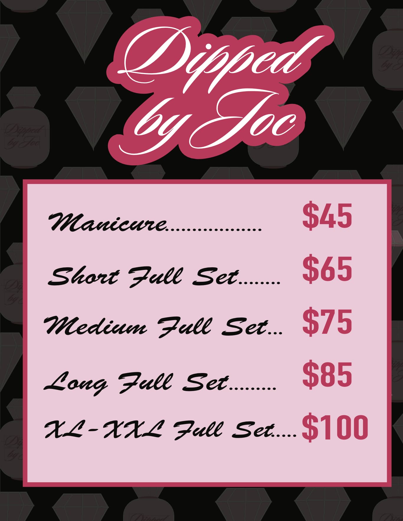
This was a instagram post to promote the prices of her business. I used her brand colors, elements from the logo, and typography to create a consistent brand image across assets.
No Suelte la Bandera
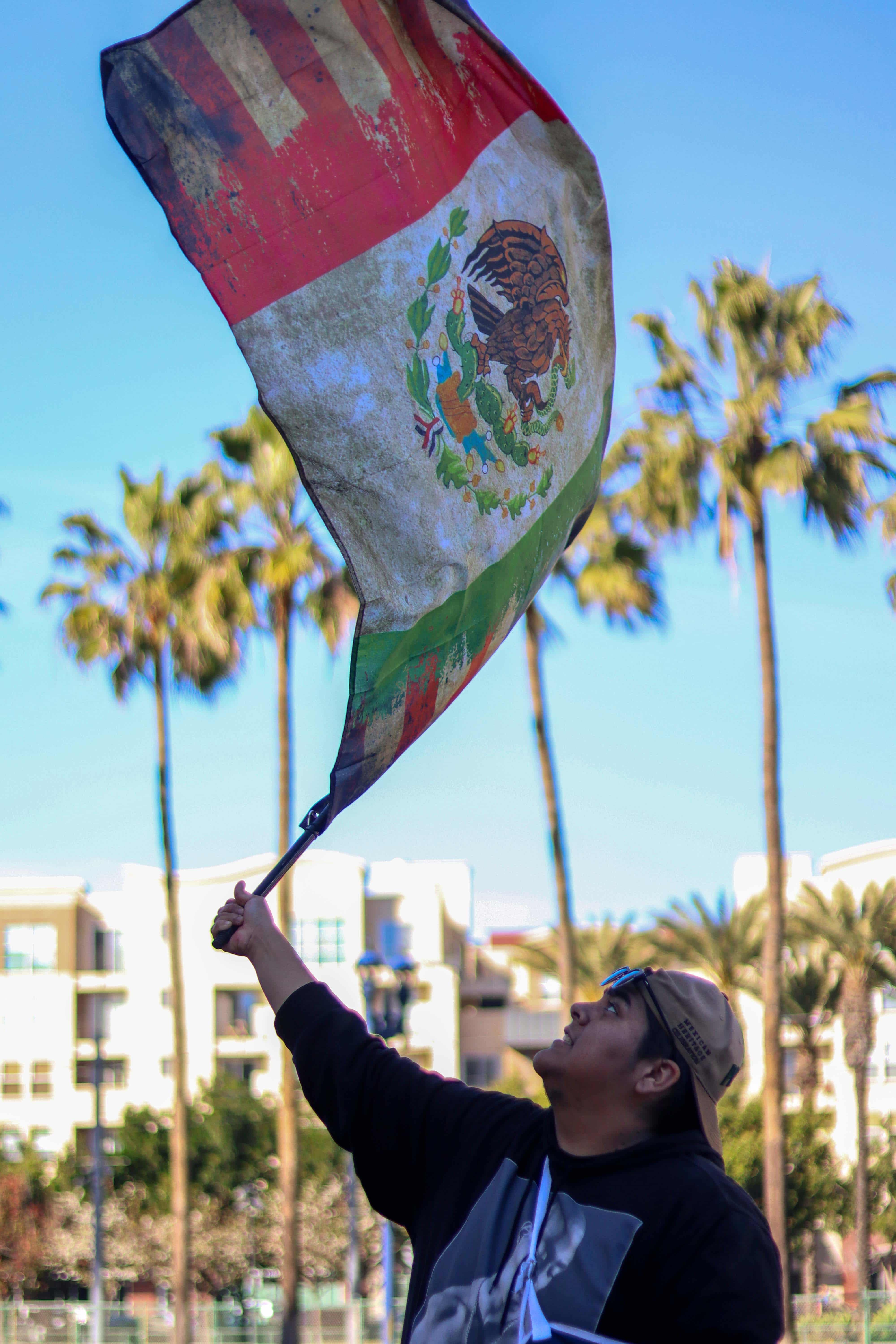
No Suelte la Bandera or don't let go of the flag is a photography project where I attended an ICE protest in downtown, San Diego. This man holds a flag representing both the Untied States and Mexico, showing that Mexican-Americans are proud to represent their nationality and ethnicity. No human is illegal on stolen land.
Summer 2025
Classes Taken
- Advertising Strategy
- Design for the Internet 1
June 2025 - August 2025
During the summer I wanted to explore user interface design. I found the media to be more layout structured and typography heavy. I learned so much about user flows and readability for consumers. It is not necessarily the bold colors and insane imagery that make the website, it is about the functionality. I was also participating in a advertising class because I had just received my acceptance letter to study advertising and public relations in South, Korea. I wanted to explore the mind of the consumer and see why campaigns are successful and what creative approaches are successful.
Horror Blog
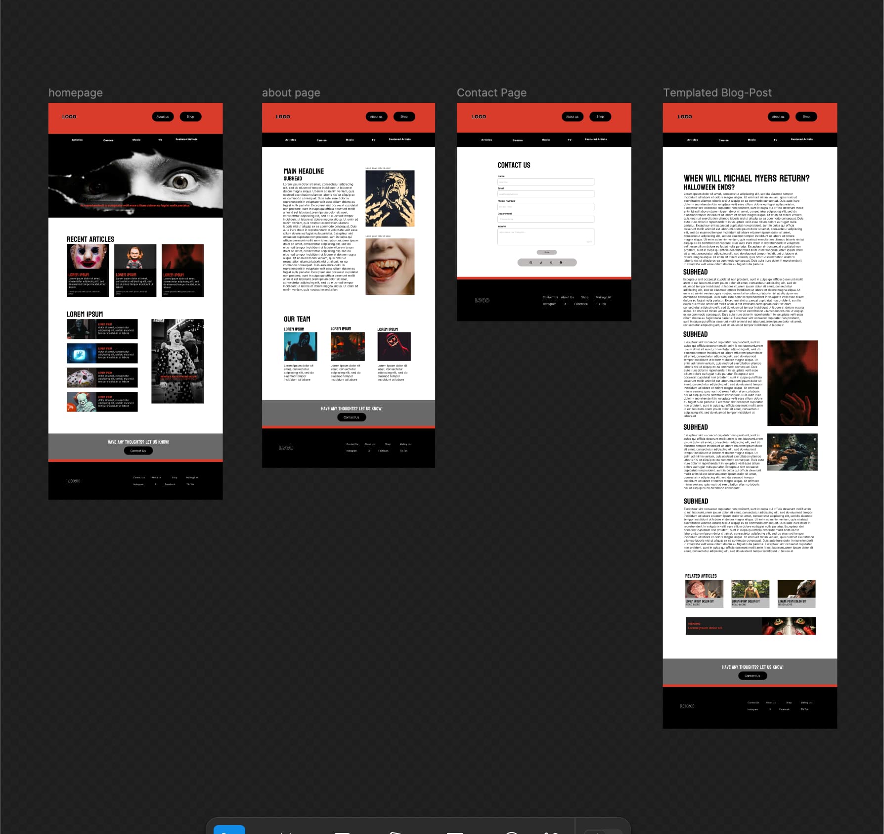
This was a personal project where I created the design for a horror blog website. I kept the themes of horror through color and imagery but maintained hierarchy and readability for users. The design is responsive, it can be viewed on phone, tablet, and desktop.
Horror Blog - Flow
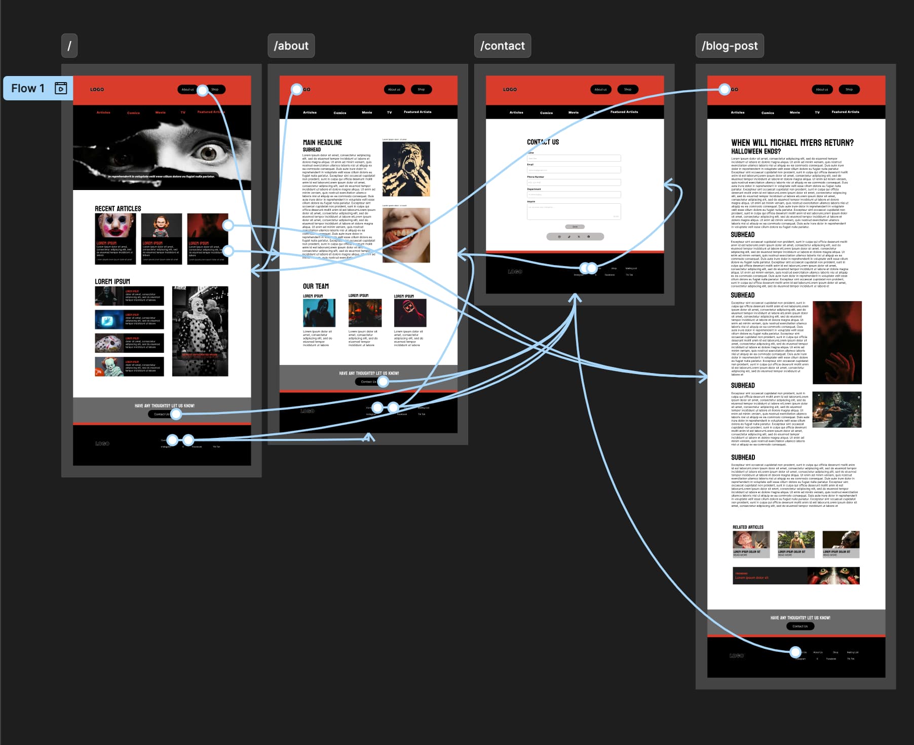
These lines show the flow of the interface. It was important for the user to easily access past articles and trending ones. It was also important for users to easily contact the owners of the site and specify which department if needed.
Horror Blog - Prototype
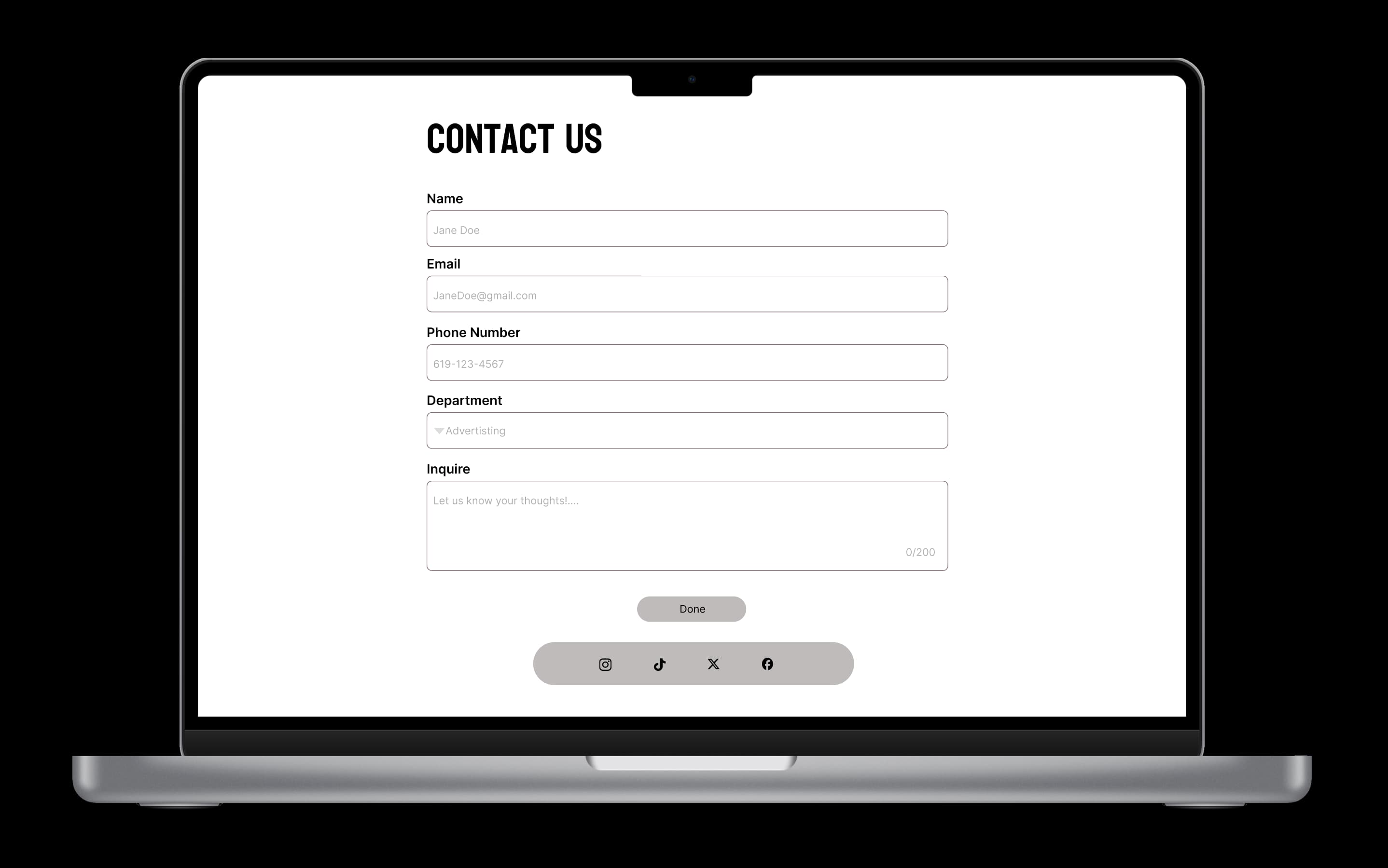
This prototype shows the final result of the interface design, providing a strong foundation for real web development. The flow of the prototype can be viewed on my portfolio under the project “Horror Blog”.
Fall 2025
Classes Taken
- Contemporary Korean Popular Culture
- Korean Language
- Digital Media Strategy
September 2025 - December 2025
In Fall 2025, I was given funding by San Diego State University Scholarships and Gilman Scholarship program to study advertising and public relations. I studied contemporary korean culture and korean language which helped me adapt into the country and better understand the culture and practices. I learned that advertising is different in each country and to make successful campaigns it is not a one piece fits all, you have to pay attention to consumers. I talked about digital media strategies and saw them play out in real time. I took notes of the things I saw and though how I could apply things like that in the United States. Being exposed to a whole different culture outside of Mexican-American made me realize I want to be more open to other cultures and represent more people within my art. I want to connect people beyond the surface of my designs.
Ikseon-dong Hanok Village
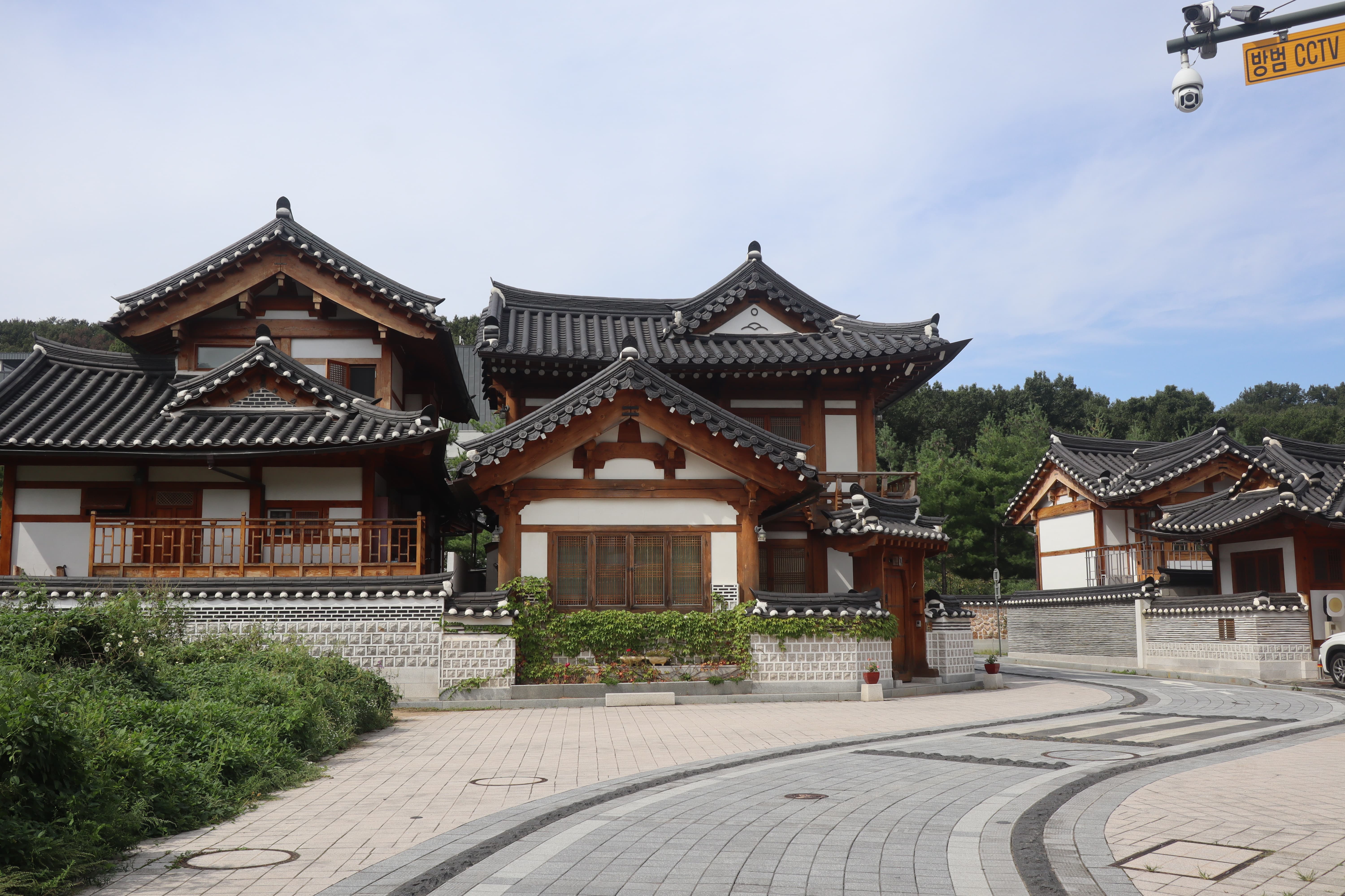
This photograph was taken at a traditional village in Seoul, South Korea. The focal point is the house on the left depicting Korea's unique architecture. The flowing organic path on the right creates a dynamic photo opportunity. In Korea, I learned to have an eye for harmony and balance in natural environments.
Seoul Global Fireworks
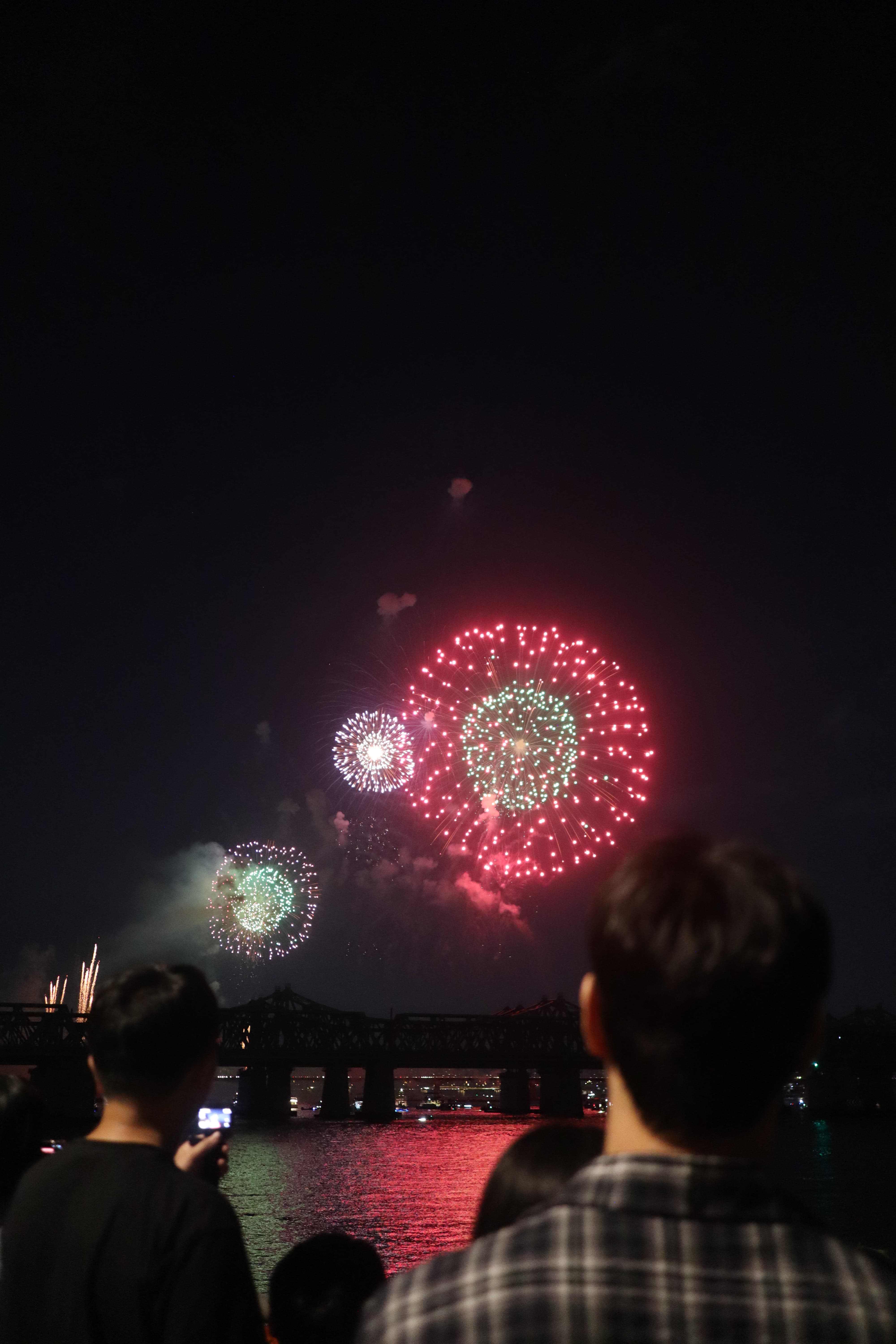
This photograph takes place at the Seoul Global Firework Competition. Everyone gathered to view fireworks from different countries, overall joining together to celebrate community and global outreach. I found it fascinating how Seoul was able to connect people from all over the globe for an annual event. This event makes me want to think of ways to have global events like this one.
Bolo Merch
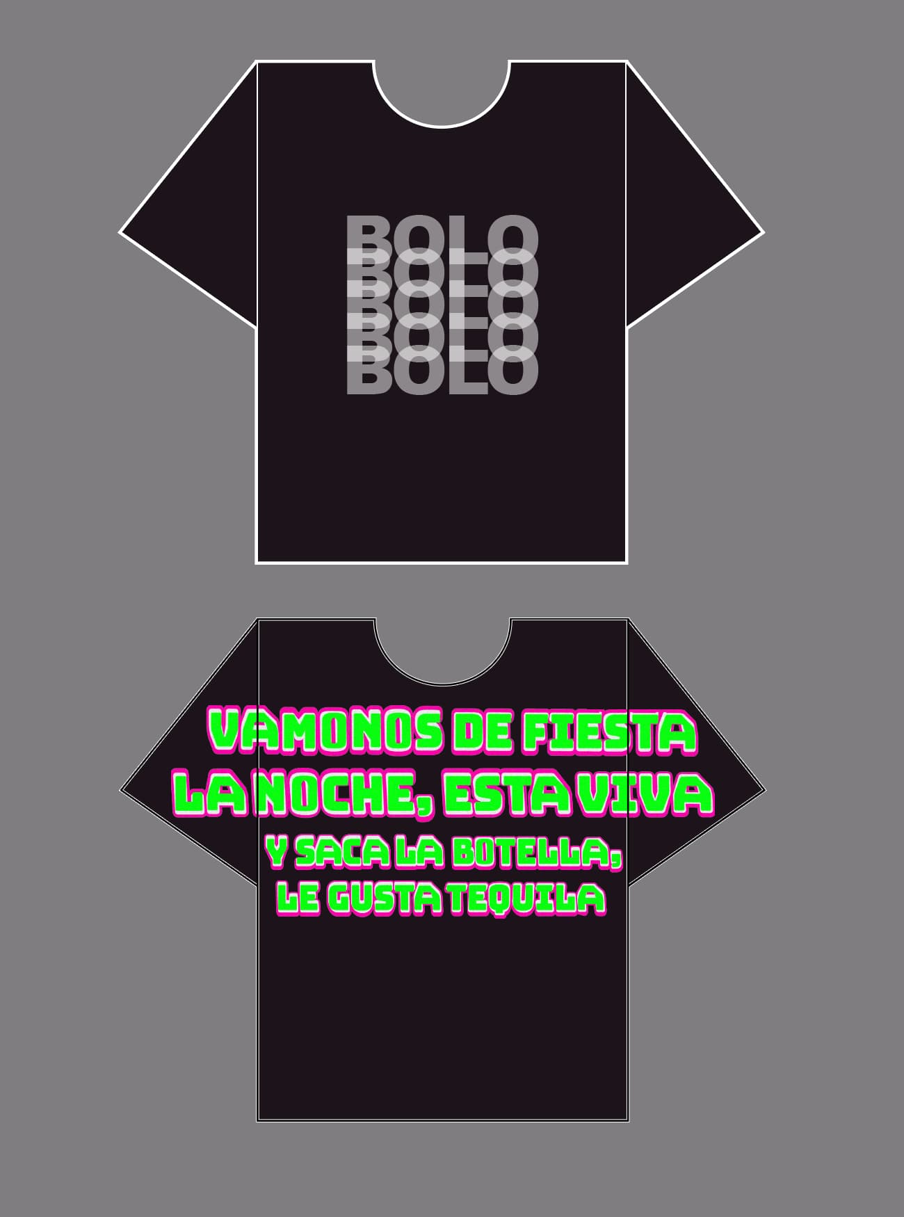
The graphics on this t-shirt mockup is a concept for one of my favorite mexican-american techno artists. Living in Korea, being exposed to so much art and entertainment, especially fashion definitely helped me update my wardrobe and taste in fashion. I have never designed graphics for fashion but I enjoyed this personal project and would love to be involved in the fashion world throughout my career.
Spring 2026
Classes Taken
- Senior Portfolio
- Packaging Design
- Experiential Design
- Design for the Internet 2
Janurary 2026 - May 2026
This is my graduating semester from SDSU. I have just arrived from Seoul with a fresh perspective and ready to create more dynamic graphics that are both eye catching and have more underlying meaning to consumers. I am proud of the work I have produced and I am excited for this next chapter of my life. Thank you for taking the time to read my timeline and hope you understand more of my growth and development as a designer.
Glamslam
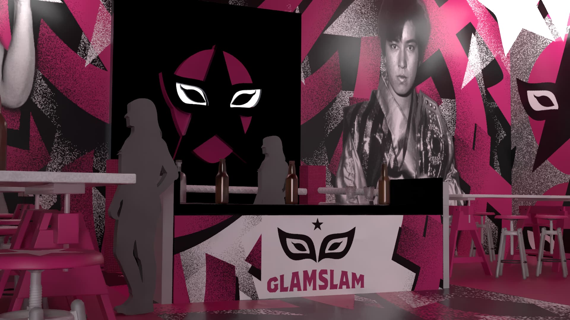
Glamslam’s concept celebrates the cultural exchange between Mexico’s Lucha Libre and Japan’s Joshi wrestling, blending the energy of sport with deeper themes of culture and community. La Dulce Irma and Jaguar Yokota are the face of Glamslam. They are the pioneers of having women respected in the sport of wrestling and were the first to travel to each others countries for competition. Mexico and Japan now have a deep relationship through sport because of these two women.
Nadia Ruby
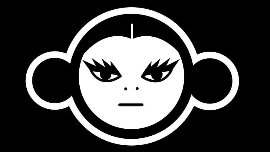
This is my first official logo branding as a designer. It is high in contrast and bold, a notable trait in all of my works. I have always felt more connected to being represented as a character rather than a typeface. This logo contains my most bold features: my hair and eyelashes. This logo is largely inspired by chinese art, toys, and culture. I was born in 2004, the year of the monkey so I used the circles on the sides of my head to represent monkey ears or the way I use to wear my hair buns as a kid. I take all my experiences from my childhood to now to represent who I am unapologetically.
Rockstar Littlebites
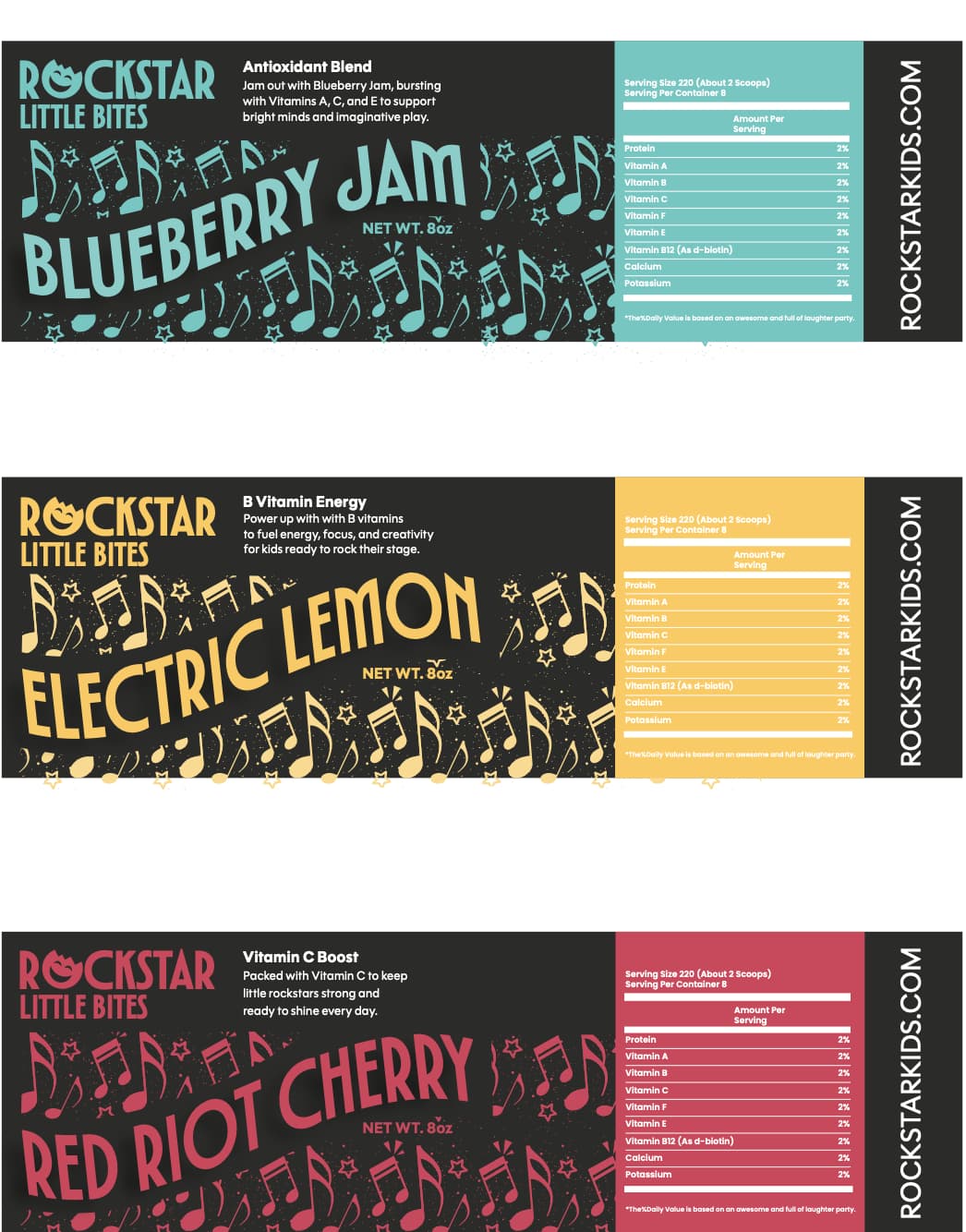
These labels are for a vitamin brand called Rockstar Little Bites. These labels are three distinct flavors represented by colors. The goal of the branding was to make it fun but approachable for parents. I noticed a lot of vitamin branding felt fake, using cartoons and characters to lure kids into eating vitamins that aren’t necessarily healthy. Rockstar vitamins want kids to make everyday their stage and inspire creativity in the classroom, playground, or even band practice.